Choosing the right exterior colors for your home can be daunting. It’s not just about picking a favorite shade. It’s about creating a harmonious look that enhances curb appeal.
Coordinating exterior colors involves more than just paint. It requires a thoughtful approach to matching the roof, siding, and trim. Each element plays a crucial role in the overall aesthetic.
The roof is often the most dominant color element. Its hue can set the tone for the rest of the house. Siding colors should complement the roof, creating a seamless transition.
Trim colors are the finishing touch. They frame and highlight architectural features, adding depth and interest. A well-chosen trim can make a home stand out.
Natural lighting and surroundings also affect color perception. What looks good in a store might differ in natural light. Testing samples is essential before making a final decision.
Popular exterior color schemes can inspire your choices. They offer a starting point for creating a cohesive look. But personal style and preferences should guide the final decision.
This guide will help you navigate the process. You’ll learn how to match roof, siding, and trim like a pro. Let’s dive into the world of exterior color coordination.
Why Coordinating Exterior Colors Matters
Coordinating exterior colors is not just about aesthetics. It enhances your home’s visual appeal and can increase property value. A well-coordinated exterior can attract buyers if you plan to sell.
Colors have the power to transform how a home is perceived. The right combination can make a small house look spacious or a large house appear cozy. It’s all about optical illusions that colors create.
A harmonious color scheme can tie together your home’s design elements, from the roof to the foundation. This cohesion is what makes a house feel complete and thoughtfully designed. It’s a subtle yet impactful way to show taste.
Moreover, well-chosen colors can evoke certain emotions. Cool tones can create a sense of tranquility, while warm tones can make a home feel welcoming. Some benefits of coordinating exterior colors include:
- Enhanced curb appeal
- Increased property value
- Mood setting through color psychology
- Architectural feature highlights
Understanding these elements allows you to strategically select colors that not only complement each other but also create a lasting impression.
Understanding the Elements: Roof, Siding, and Trim
The roof, siding, and trim are the primary elements of your home’s exterior. Each plays a unique role in defining its overall look. Understanding each one is key to creating a cohesive color scheme.
The roof often serves as a dominant color anchor. Its large surface area naturally draws the eye, setting the tone for other design elements. Roof colors tend to be more muted, serving as a backdrop for other features.
Siding is essentially the canvas of your home. This part offers the most flexibility in color choice. It sets the overall vibe, whether you aim for a classic or modern aesthetic. Darker siding can ground a house, while lighter colors can make it appear larger.
Trim acts as the finishing touch and highlights architectural details. Well-chosen trim colors can frame windows and doors, making them pop. Trim colors often contrast with siding to add depth and interest.
Consider the following when coordinating:
- Roof: Muted and enduring hues
- Siding: Flexible with bold or neutral options
- Trim: Accentuates with contrast or subtle harmony
By strategically selecting colors for these elements, you ensure balance and unity in your home’s exterior design. Thoughtful coordination can highlight your home’s architectural strengths while masking minor flaws, creating a picture-perfect exterior.
Choosing a Cohesive Exterior Color Scheme
Choosing a harmonious exterior color scheme requires careful planning. Begin by analyzing your surroundings and neighborhood. These elements provide a natural palette from which to draw inspiration.
Think about the style and era of your home. Historical homes might favor more traditional color palettes. Modern designs often embrace bold, contrasting colors for visual interest.
Consider the emotions and mood you wish to convey. Blues and greens evoke calmness, while reds and oranges create warmth and energy. It’s crucial to decide what feelings you want your home to evoke.
Using a color wheel can simplify the process. Complementary colors lie opposite each other on the wheel, providing striking contrast. Analogous colors, found side-by-side, offer a more harmonious transition.
Here are some steps to follow:
- Explore your environment and neighborhood style.
- Determine your home’s architectural era.
- Consider the mood you wish to communicate.
- Use a color wheel to find complementary or analogous colors.
- Test your chosen colors under different lighting conditions.
Don’t forget about texture when selecting colors. Natural stone, brick, and wood contribute to the overall appearance. Their texture and hues should complement your color choices.
Before deciding, visualize your plan. Use samples and swatches to test color choices against your home’s existing materials. Pay attention to lighting changes throughout the day to ensure the scheme remains vibrant and attractive.
Creating a balanced exterior color scheme involves more than just aesthetic preferences. It involves aligning your home’s elements in a way that’s pleasing both to the eye and to the environmental context.
How to Select the Right Roof Color
Selecting the ideal roof color is foundational in coordinating exterior colors. The roof often covers a significant portion of a home, impacting overall color schemes. Before selecting, consider the material of your roof, as some materials offer limited color options.
Your home’s architectural style can guide your roof color choice. For instance, Spanish-style homes often feature terracotta tiles. Victorian homes may include slate or dark shingle roofs. It’s essential to respect these traditions for a cohesive look.
Climate plays a role, too. Light-colored roofs reflect sunlight and keep interiors cooler, a practical choice for hot climates. Dark roofs, conversely, absorb heat, which might suit cooler areas better.
When picking a roof color, keep these tips in mind:
- Assess your roof’s material and color limitations.
- Consider the architectural style’s traditional roof colors.
- Factor in local climate and the functional benefits of roof color.
- Make sure the roof color complements the surrounding landscape.
Finally, think about how the roof color interacts with other elements of your exterior. The roof color should create balance and not overshadow the siding or trim. Harmonizing these elements enriches your home’s visual appeal. Select a color that stands the test of time, enhancing curb appeal while being practical.
Siding Colors: Complementing the Roof and Setting the Tone
Choosing the right siding color is crucial in establishing your home’s overall style. It sets the primary backdrop against which other exterior elements are showcased. Start by considering how the siding complements your roof color. The goal is a seamless and attractive flow.
Siding provides an opportunity to highlight your personal style. While neutral tones are enduring and versatile, vibrant colors can offer distinction. Whether your preference leans toward earthy hues or bold shades, balance is key to creating an inviting exterior.
Don’t overlook the architectural style of your home when selecting siding colors. For traditional homes, warm and classic colors may enhance the home’s charm. Modern structures might benefit from sleek, clean lines achieved with cool colors or minimalist shades.
To aid in your choice, consider these tips:
- Ensure harmony between the siding and roof.
- Reflect personal style while respecting the architectural design.
- Opt for colors that either blend with or highlight your home’s surroundings.
- Consider classic tones for traditional homes and sleek lines for modern designs.
Finally, the surrounding environment influences siding color choice significantly. Nearby natural landscapes or urban settings may dictate cooler or warmer tones. Your siding color should integrate seamlessly with these elements, enhancing your home’s curb appeal. A well-chosen siding color sets the stage for a harmonious and memorable exterior look.
Trim and Accent Colors: Framing Your Home’s Features
Trim colors play a vital role in defining architectural lines. They frame windows, doors, and edges, accentuating your home’s structure. Choosing the right trim color enhances these features without overwhelming the overall design.
Accents, such as shutters and doors, serve to add interest and depth. They offer an excellent chance to inject personality and style. A classic color like white or black trim provides a clean contrast, while bolder choices can make a striking impact.
When selecting trim and accent colors, consider how they interact with your main exterior colors. Contrast is often the goal. A soft siding color may benefit from a crisp trim, while dark sidings can be paired with lighter trims.
Here are some tips to remember:
- Choose trim colors that highlight and frame architectural elements.
- Use accents to add personality and character to your home’s appearance.
- Consider the balance between boldness and subtlety for a cohesive look.
Finally, don’t underestimate the impact of trim and accents on curb appeal. These elements can dramatically alter how your home is perceived from the street. Careful selection ensures a harmonious, inviting, and well-composed exterior design.
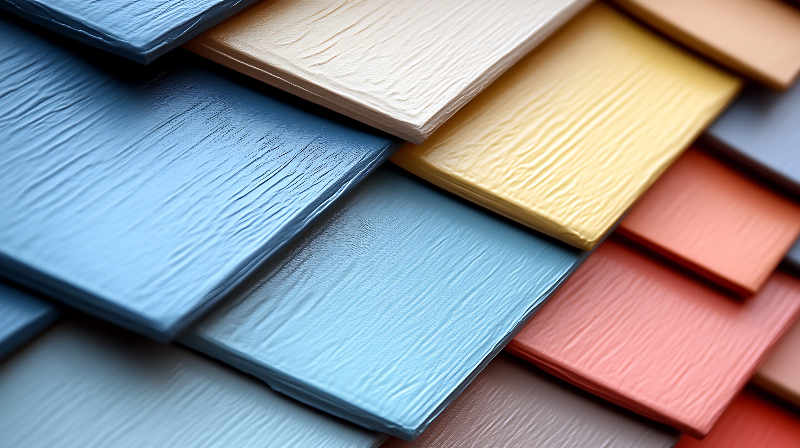
Using Color Tools: Swatches, Samples, and Visualization Apps
Selecting the perfect exterior colors requires more than just imagination. Color tools, like swatches and samples, offer a tangible way to compare hues. These tools help in visualizing how colors will appear on your home.
Swatches are a great start but are often too small to capture full context. Larger samples painted on different areas of your exterior give a better picture. This approach helps in assessing colors under varied lighting and weather conditions.
Technology can elevate this process further. Visualization apps allow you to upload photos of your home. You can then experiment with different color combinations digitally. This method provides immediate feedback and can help solidify choices.
Here are some tools and tips to utilize:
- Use color swatches for initial selection.
- Paint larger samples on different sides of your home for better judgment.
- Leverage visualization apps for easy and interactive experimentation.
By making smart use of these tools, you’re better equipped to make confident, informed decisions about your home’s exterior color scheme.
Considering Lighting, Surroundings, and Neighborhood Aesthetics
When selecting exterior colors, the influence of natural light is crucial. The same color can appear different from morning to night. Therefore, viewing your samples in various lighting conditions is essential.
Consider your surroundings as they also play a pivotal role in color perception. A forest backdrop might complement earthy tones, while a beach setting could inspire coastal hues. Colors should harmonize with the natural environment to enhance your home’s aesthetic.
Neighborhood aesthetics can’t be ignored either. Blending in yet standing out is a delicate balance. While you want your home to reflect personal style, it’s wise to remain in tune with neighboring homes.
Points to ponder include:
- Test colors at different times of day.
- Draw inspiration from natural surroundings.
- Respect community color schemes for neighborhood harmony.
Properly weighing these factors ensures your exterior colors enhance your home’s appeal while offering a cohesive look within your locale. This thoughtful coordination leaves an impressive mark on visitors and passers-by alike.
Popular Exterior Color Schemes and Trends
Today’s exterior color schemes offer a mix of classic and modern choices. These combinations cater to varied tastes and architectural styles. They also align with current design trends.
Neutral tones remain a favorite for many. These colors offer a timeless elegance and versatile backdrop. Shades of gray, beige, and soft whites can easily pair with vivid accents.
Bold color contrasts are another trending choice. Homeowners are embracing daring palettes like deep navy or charcoal with bright whites or vibrant reds. This bold approach creates eye-catching curb appeal.
In addition to timeless and bold hues, earthy palettes have gained traction. People are drawn to warm browns and greens that exude harmony with nature. These colors blend beautifully with natural surroundings.
Explore these trending schemes:
- Classic neutral palettes for versatile elegance.
- Bold contrasting colors for a striking impression.
- Earthy tones that connect with nature’s beauty.
Opting for a trendy color scheme not only modernizes your home but also reflects a current style sensibility. Such selections can enhance both personal enjoyment and marketability.
Common Mistakes to Avoid When Coordinating Exterior Colors
Selecting exterior colors can be tricky. Avoiding common pitfalls can save time and money. A well-thought-out plan can help enhance your home’s appearance.
One mistake is neglecting existing elements, like brick or stone. These materials often dictate the color palette. Ignoring them can create a disjointed look.
Overlooking the impact of light is another error. Colors can appear different in varying lighting. It’s crucial to test samples in natural light.
Other frequent missteps include:
- Choosing too many contrasting colors.
- Ignoring neighborhood guidelines and styles.
- Rushing the decision without testing samples.
By being mindful and taking time to test and consider, you can achieve a cohesive and appealing exterior color scheme for your home.
Pro Tips for a Flawless Exterior Color Update
Refreshing your home’s exterior can boost its curb appeal. Doing it right requires some expert tips. Here are a few to keep in mind as you plan your update.
First, assess your home’s architectural style. Different styles work best with certain color schemes. This can help guide your palette selection for a harmonious look.
Next, invest in quality materials and paints. High-quality products often offer better durability and color retention. This means fewer touch-ups down the line and a longer-lasting finish.
Here are additional key tips for a successful update:
- Use a color wheel to find complementary shades.
- Coordinate with landscaping and garden elements.
- Consider seasonal changes in lighting and color perception.
By following these steps, you can ensure your home’s exterior is not only beautiful but also enduring. Thoughtful planning and attention to detail are key for a standout result.
Conclusion: Creating Lasting Curb Appeal with Coordinated Colors
Coordinating exterior colors effectively can transform your home’s appearance. Choosing the right hues for the roof, siding, and trim enhances curb appeal and adds value. A well-thought-out color scheme offers a cohesive and inviting look that reflects your personality and style.
Remember that patience and planning are crucial. Use tools like color swatches and visualization apps to test ideas before committing. By considering architectural style and surroundings, you ensure that your exterior colors will impress. With the right approach, your home can become a neighborhood standout, combining beauty with lasting charm.